Konami and Disney Interactive did not create the arcade sport experience. Nor were they the first to bring it to consoles. They did however set a standard that gamers looked for in every non-sim sport title. The best of the lot and the one most closely emulated was Disney Sports Soccer. It made it's debut in 2002 and has held up well over the years. The combination of fantastic playing fields, magical powers and appropriate redesigns of iconic characters was seen more recently in another Nintendo game.

The Super Mario Strikers series, developed by Next Level games, was first published by Nintendo in 2005. It incorporated many of the elements seen in Disney Sports Soccer and developed a few of its own. The game had a more aggressive feel than the Disney title as the field was bordered by an electric fence, which players could shove opponents into, as well as elements from the Mario series like the Chain Chomp and Thwomps which could litter the field and become obstacles. For many gamers the best thing that Next Level did with the series were the character redesigns.
Most of the Mario cast returned in this game with a visual overhaul. The colors assigned to the characters were familiar, however it was the cut of the uniforms and associated designs which showed much more attitude than gamers were used to seeing. This was especially true for the family-friendly cast. In 2007 the concept art for the Strikers sequel showed even more attitude than any Mario game to date. The once soft and round characters were now drawn with sharp angles and angry expressions. Was it pretentious to have Western developers (Next Level was a Canadian studio) redesign the popular Japanese characters or was it refreshing? That depended on many variables. The redesigns were good but ultimately dated by their design choices. They seemed too pop, owing more to the tastes and trends of contemporary character designs. Whereas the Disney titles featured uniforms, patterns and color combinations that were closer to traditional cuts but could not be dated to any particular era or design trend.
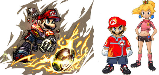
There was a fine line between updated designs that were appropriate for a character and those that were absurd. The ones that made the most sense were applied to a particular genre. In the sports world it was logical that Mario and company wore uniforms that fit on the soccer field. Running around in tight overalls and clumsy boots would not have been silly. These characters also had to be presented with stern faces and serious expressions. Sports may be fun but competition can also be highly intense. It was only appropriate that Mario and his friends be set with a hint more attitude and aggressiveness than gamers are used to seeing. This helped add a new dimension to the character, while complimenting the things that were universally understood about the character, including his bravery and selflessness. The concept art provided for the Disney sport games did much of the same thing. They presented the icons with more expressions of attitude than gamers were used to seeing. My coworker commented that Mickey Mouse should never be scowling, he was supposed to be a perpetually cheerful and friendly character. I reminded her, as Epic Mickey will remind audiences, that the Disney characters were once capable of showing a broad range of emotion, including anger, fear and resentment. These things did not detract from the characters but instead made them appear more alive and personable. Especially more than any grinning mascot on a tee shirt ever could.
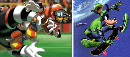
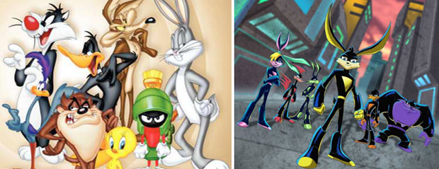
Emotive qualities added a dynamic to the cast that also reflected their personality. It was something too easily missed by most designers trying to recreate or re-imagine the icons. Attitude became a replacement for substance. Iconic characters that were made famous in the 1930's soon found it hard to remain relevant, at least under modern producers. In 2004, between the Disney and Mario redesigns, the classic Looney Tunes characters were recast by Warner Bros. as superheroes with plenty of 'tude. Loonatics Unleashed failed to make a significant impact with audiences and was in fact petitioned against for having character designs that were too edgy and stylized. The series was cancelled after two seasons. Critics pointed out that the characters lacked the personality and dimension of the icons they were trying to emulate. They feared that the show was pandering to the "extreme" generation without taking into account all of the elements that made the original characters like Bugs Bunny, Daffy Duck and the Tazmanian Devil work.
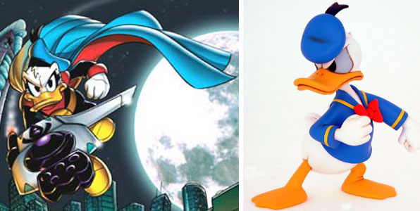
The problem of giving classic cartoon characters special powers was not limited to the WB. Disney brought back an old Donald Duck comic book alter ego known as the Paperinik / the Duck Avenger / Phantom Duck. The various nicknames were shortened to PK Duck and a videogame bearing his likeness was released. Despite having an actual legacy to fall back on, the reception to the character and game was chilly, scoring less than average in most reviews. Players had expected that a Disney game with Donald Duck as the protagonist would end up being more like the better received Goin' Quackers. Both games were actually developed by UbiSoft, demonstrating that some redesigns did not work well even from the same publisher of a previous solid game.
The use of attitude and contemporary design choices have not always worked well for characters. Too much reliance on visual appeal, rather than reflecting personality type, or staying true to the character's origin have sunk many cartoon as well as videogame characters over the past 15 years. When done correctly even the biggest of the names, like Mickey Mouse could be given an extreme makeover while still retaining the classic charm. Audience saw how Pete (as the enormous Julius) and Mickey swapped places in the animated short Runaway Brain. It was a clear example of how even the most extreme changes to an icon could work under the right circumstances. It demonstrated how design and purpose are meant to work together and not one taking precedence over the other.
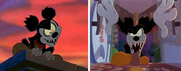
But I digress... I was speaking more on how Konami was able to create a legacy that would be emulated around the industry.
Nintendo was not the only studio that created an arcade soccer experience. Sega had released a 3-on-3 soccer game in 2002, the same year as Disney Sports Soccer. Sega's Soccer Slam had a familiar, frenetic gameplay with over-the-top character designs, tight but memorable stadiums and special attacks. It was a very fluid game that relied on quick reflexes and expert timing to be enjoyed and was one of the few arcade soccer titles that was rated higher than Disney Sports Soccer. The use of passes, attacks and combos in dribbling was akin to the "Street" series of games that EA was producing.
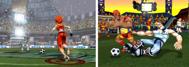
EA was not asleep during the early 2000's. They had become keenly aware as to what Konami, Disney, Sega and Nintendo were producing but did not have an answer right away.
Electronic Arts was responsible for relaunching the arcade-style sports game for consoles with the debut of NBA Street in 2001, which also happened to be one of my favorite games of all-time. Considered by many to be the spiritual successor to Midway's NBA Jam series, EA was able to incorporate the MixTape style of playground basketball with high profile athletes. EA took the superstar athletes out of the stadiums, dressed them down and used actual courts from around the country. This endeared the franchise to the gamers that felt EA was spending too much time creating sim experiences and ignoring the elements that made many fall in love with the sport to begin with.
The success of NBA Street caused EA to launch an entire franchise of games, covering many of the same bases as the Disney Sports titles over the next eight years. A sequel to NBA Street in (2003) and even and the first entry of NFL Street (2004) were released before they created a soccer entry for their catalogue. There were some great elements in FIFA Street. Lessons that they learned from the other entries in the series. Not the least of which were the high-profile names to attach to the project or the dazzling locations found outside of the stadiums.

Unfortunately, like Disney Sports Soccer, EA found that it set a high mark with it's first game but was unable to recreate the magic in other genres. The NBA Street series managed to maintain consistently high scores yet NFL Street rated slightly higher than average and FIFA Street barely average scores after debuting. It was the last version, FIFA Street 3 released in 2008 which had the most dramatic overhaul to the visuals and controls. The game incorporated nuances from the NFL title, in which characters could run along walls for short bursts to get around opponents, as well as build a combo meter to unleash a powerful strike. Despite these things the game failed to break into the scores seen for the NFL and NBA games. The perfect arcade soccer formula had managed to elude EA, in this regard Konami and Disney had upset the behemoth. What EA did manage to accomplish was become one of the first western developers to clue into the use of exaggerated proportions for sport titles.
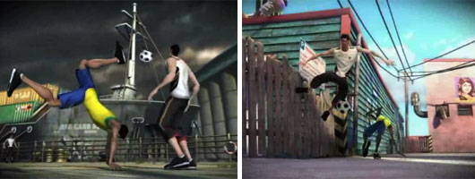
EA had been using exaggerated proportions early on in the franchise. Characters in their respective sports looked like distorted versions of actual athletes. American Football players were thicker and more muscular, NBA players taller and lankier and soccer players very diverse in their proportions. To get a sense as to how far EA has stretched the proportions over the years compare the realistic style of the characters in Madden 11 for the Xbox 360 and Playstation 3 to the cartoonish athletes for the Nintendo Wii. The use of simpler models for the Wii might be due to the limited processing power of the console, however the character designs had become very popular in gaming regardless of system. The last of their Street titles, which happened to be the FIFA game, highlighted this transition from realistic to cartoonish proportions.
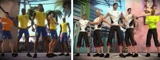
Other studios in the west were keen on this style of art and presentation and began incorporating it into their own games. When Academy of Champions Soccer was announced I was intrigued with how UbiSoft was going to approach the arcade soccer style. Would it have the same charm of Disney Sports Soccer? The fast paced matches of Sega Soccer Slam? The polish or Mario Strikers? Or would it fail to make a significant impact among gamers? One thing was certain, the 2009 title had a very bold artistic style. It was something that I covered in a blog titled How sports changed the 3D aesthetic. The game itself had an arcade feel and introduced adventure-style quick time events to shake defenders from steaking the ball. This element slowed down the pace of the game and possibly did not work well for a sport title, but the other elements seemed to work very well together. The artistic direction was unique, the level designs meant to conjure up images of magic and super powers for the young football stars, and cameos from the UbiSoft library appeared as playable characters.
The control had incorporated a very progressive gameplay tool. Players could mark where on the net they planned to strike via a red bullseye and could concentrate on passing the ball and setting up the shot instead. Players could freely move this target as they progressed up the field. It was something that I do not think had ever been done before in any soccer game and a minor gameplay element which made the game special. UbiSoft managed to rate higher than all of the FIFA Street games, according to Metacritic, but failed to approach the reactions set by Sega Soccer Slam or Disney Sports Soccer. The question for the industry was what else they learned from the attempt to get the Disney Sports Network off the ground? I shall go over this in my next and final blog on this series.
No comments:
Post a Comment